Character redesign!
It's been a while since our last post, so I decided to share some news about the development.
Sometimes when you are working on a project for too long, you have to deal with some really old design decisions. As we said before, Ruby Chest was a project from 2013 that we're re-making on Unity, so I catch myself thinking "why is this like that?" all the time. It's also hard to measure how much it's worth to go back on these decisions - sometimes it's better to embrace the imperfections of your game so you can get things done, otherwise you'll be working on it forever.
Of course, we are making plenty of improvements on the original version (I'd like to make another post about this someday), but there are also some things that I decided not to change for practical reasons. That is, unless there's a very simple solution under our nose that won't require days of re-designing.
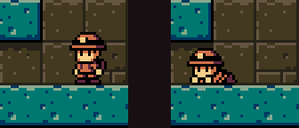
For example, there has been a lot of feedback about how the gaps seem too tall for the kid to have to crouch. People were frustrated that the kid couldn't just walk through them - and it looked even weirder when they pressed down and the character started crawling like if they were squeezing through very narrow gap, when there was plenty of space above.

Even after hearing a lot this feedback, I treated it as a lost case - I remembered having thought about all possibilities in the past and coming to the conclusion it would just have to be like that. So I avoided going back to that decision, like if it was a taboo. This would have to be a characteristic of the game, because for some reason this was the only possibility and I had already made all level design and mechanics based on those proportions.
But this feedback started getting too common. Some people suggested the character was smaller so they would simply walk through 1-tile gaps without having to crawl. But in an exploration game like this, crawling is a very important mechanic. I like hiding secret passages by covering them with suspicious non-colliding tiles, so mechanics that require input to make the character fit through small gaps (e.g. Metroid's morph ball and Axiom Verge's drone) are a nice way of guaranteeing that players guarding players from accidentally finding a secret passage while walking around. Plus, it adds a lot to the claustrophobic theme of ruin exploration, and some important parts of the level design count with the crawling mechanic (while crouched, the protagonist can't jump, so it's good to ensure they fall down a hole while going through a narrow passage). And eliminating 1-tile gaps from the game at this point was also out of question because of the hammer mechanic, and the whole level design had already been done with that in mind.
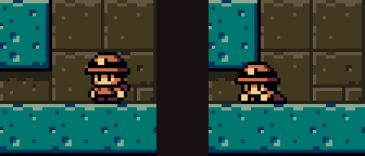
The simple solution to fix the gap problem while keeping the crawling mechanic would be to make the gaps actually be less than 1 tile tall. Then I remembered why I though this was an unsolvable problem - In the original version of the game, made with Processing, the whole collision system was implemented by me, and it was very limited. Making a half-tile collision would be unthinkable with that code. But then I realized - I can do custom tile collisions in Unity!
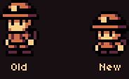
When I realized this would fix the problem and actually had no drawback, I felt relieved. So we did it quite quickly: We redesigned the hero's proportions and implemented tiles with half-collision.


The result is a character that looks a lot more like a child and is much more nostalgic too (because it fits a 16x16 tile like Link from Link's Awakening). I also think it fits more the overall tone of the game and looks a little bit more like the official art that has been made by Lumi.
Last but not least, last month Fabio and Lumi took the latest version of the game to the demo corner of IGDA Finland`s monthly gathering.

Plenty of people played and had a great time. For the first time, we didn't have any complaints about the gaps! It seems like our latest tweaks have really improved the game \o/
There is still some time until the release of the game, and want to make a few more adjustments before releasing the new version of the demo, so be patient :)
Oh, and please tell us what do you think about the new design!
Get Raider Kid and the Ruby Chest
Raider Kid and the Ruby Chest
Take some time off from your family vacation and delve into ancient ruins!
| Status | In development |
| Authors | Cacareco Games, lumimae, chambers, Fabio Picchi, blipsblops |
| Genre | Platformer, Adventure |
| Tags | Exploration, Game Boy, Metroidvania, Pixel Art, Puzzle-Platformer, Retro, Singleplayer, Unity |
| Languages | English, Spanish; Latin America, Portuguese (Brazil) |
More posts
- Original Soundtrack is Coming!11 hours ago
- One week in!7 days ago
- Patch [1.0.1] - Early Fixes & Adjustments14 days ago
- Raider Kid is here!16 days ago
- Release Date Announcement!21 days ago
- Final sprint!Nov 05, 2023
- Hammer revamp!Jun 27, 2023
- Beta is ready to go!Jan 14, 2023
- Happy New Year!Dec 31, 2021
- The Dowsing PendulumSep 07, 2021

Comments
Log in with itch.io to leave a comment.
Just played the demo and I thought it was wonderful! Just really, really nice and cute. It feels just as I think it should and I like the sound design a lot as well. I found 3 doughnuts. :) I'll keep an eye on this one as it develops. Very cool! ^_^
I don’t know if this was intentional or not, but because you put the project page into draft no one can see your blog posts anymore. (I’m an itch.io admin that just happened to stumble across this page)
I recommend keeping it public but selecting “No new downloads or purchases”
Thanks! Yeah, it was accidental, we were preparing new screenshots due to our main character redesign.
Thanks for the heads up!
I like the new character design and agree with you on exploring... and how crawling fits in. That's one way of finding secret rooms, hidden treasures, it's dangerous and claustrophobic but exiting too. :)